Tuesday 1 June 2010

Foil Blocking


I have been trying to decide what to do to the front cover of my books and have finally settled on foil blocking. On book I have made in the past I have made dust covers, which I think if not done really well cheapen a book and also screen printed onto the buckram. The screen printing didn't work well last time and is a bit of a lengthy process that I am not really interested in doing again. Foil blocking seemed like the logical choice as it would provide me with a professional finish that I won't have to do myself. I only want the title of the books and my name, positioned centrally on the cover, so screen printing seemed like a lot of extra work for very little gain. Foil blocking will also stand out a bit more if I decide to go for a gold finish. The only downside is that the place I have found to do it are closed all this week so I will not have it done for submission but I can get it done before the exhibition, which is what really matters.

New Title & Title page


London Book


Leeds Book

I decided to go with a different name rather than New British Patriotism. Instead I decided to call both books 'A Tale of Two Cities'. The change was mainly down to the change and shift in the project itself and what I was taking photographs of and why. Originally the project was very much focused around race and multiculturalism and looking to push a sense of a new sense of patriotism that encompasses everyone who call the UK their home. I drifted away from this idea slightly and i wanted a more general title that showed that it was more a journey through two different cities. There are also the connotations that arise through the use of using the same name as the famous Charles Dickens novel. the following quote is from wikipedia that quickly describes the book:

A Tale of Two Cities 'depicts the plight of the French peasantry demoralized by the French aristocracy in the years leading up to the revolution, the corresponding brutality demonstrated by the revolutionaries toward the former aristocrats in the early years of the revolution, and many unflattering social parallels with life in London during the same time period. It follows the lives of several protagonists through these events, most notably Charles Darnay, a French once-aristocrat who falls victim to the indiscriminate wrath of the revolution despite his virtuous nature, and Sydney Carton, a dissipated British barrister who endeavours to redeem his ill-spent life out of love for Darnay's wife, Lucie Manette.'

I think the fact that I became interested in class throughout the project reflects well with the use of the title and what Dickens was trying to portray within his novel.

I also decided to stick with the cover design that used the text over the top of one of the photos. I always knew that I wanted to use the photo of the closed down African Community Link project for my London title page as I thought it was a strong image and raised questions about multiculturalism with in a community. I then managed to find a shop front in Leeds that had a painted Ghana flag on the front and thought the contrast between an open shop and a closed community project was interesting. I also decided to make the text smaller and tried to used the plain space in both images to place it.

Book Development


Buckram


Thread to match

I have now decided on what colours I am using for the covers of my books. I have decided to stick with the green buckram that I have used on my practice books but then contrast this with a blood red colour. I thought both were classic colours and had a very British feeling, which is a bit of an abstract feeling but I guess short of going for white and red or blue, white and red they were colours that worked for me. I still haven't decided what colour is going to be used for what book, I think I will just let that be a unconscious decision when it comes to binding both books. I also managed to find thread to match both colours so I think i will try to make so that the thread is a bit more discreet, as on Japanese binding the thread is left exposed.

'Photoshoping'


Image after using Photoshop


Original Image

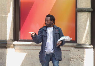
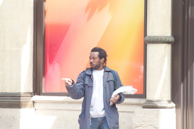
I have never claimed to be an expert when it comes to using photoshop and I think that this boils down to the fact that I would rather never have to edit my photos in it. This however raises the problem that I am not a technically advanced enough photographer to not have to use it, especially for a project like this where I wanted the images to look well finished. It has been a bit of a learning curve in terms of using photoshop as I have developed new skill that I didn't have prior to the FMP. I would however had liked to have spent a bit more time on each image as some of them had to be rushed through due to the fact that I hadn't left myself a lot of time towards the end of the project to print the pages.

I think that I wouldn't have been able to use a lot of the images I have if it wasn't for photoshop because some of them were quite under or over exposed and I think that this was down to the fact that it was the first time I had tried shooting people in a documentary style, where you sometimes don't have a lot of time to set up your camera for the shot.


After looking at the Tony Ray-Jones book by Russell Roberts I thought that it would be interesting and important for my project to look at how I write down my plans and keep myself on track. I have a diary that I use to plan my week and make notes along the way. I do have to admit that some weeks I get really into this and then others I don't use it and I end up just writing things down on bits of paper and then keeping them for as long as I need to. It has been an interesting process to look back at how I have planned and to try and understand how successful I was at this. I think it is a bit of a amalgamation of techniques that I use but having a diary definitely helps me out.

Nick Waplington - Double Dactyl


I have looked at other projects by Nick Waplington throughout this research project so I went back to the library to have another look to see what else he had done and stumbled upon this book 'Double Dactyl'. This collection of photographs shows a different side to the project I looked at before due to the fact that only about a third of the photographs feature people in. The images are described in the book as conveying 'a sense of barren desolation, a bleakness made up of washed out colours, forlorn exteriors and empty landscapes mostly taken from the middle distance.' I found myself drawn to these images because even though many of them were dealing with the benign and regularity of things we see all around us they are still captivating and interesting. There are also the themes of community and working class that he is looking at, which link well to my work and I think they are portrayed perfectly by the last photograph above of Bethnal Green Road, which depicts a cross section of a London community.

Tony Ray-Jones


Front Cover


Contact Sheet


Note on photographs and projects


Book mock up


I found this book on Tony Ray-Jones very interesting, not only because of the many images of England from the 1960's but also because it provides a great deal of insight into what Ray-Jones was thinking and his approach towards a project, in terms of planning etc. This can be seen through the various images of his notebooks and filofax pages, where it shows in detail the level of planning involved in most of his photography projects. This got me thinking as to how much I have planned throughout this project. I have set aside specific days to photograph and had a pretty good idea where I was going but apart from that I let myself be relatively free when it came to what images I wanted. The main exception was at the end of the project where I had it in my mind that I wanted an image of a west indian person in Leeds, so I made sure I returned to Chapletown to get the photo I wanted.